.svg)
Created by: Guðrún Eydís Jónsdóttir
In this article, you are going to learn about the column designer in exMonDM.
Contents:
Getting started
- To add, remove or change column properties press the Table Designer button in the desired table.
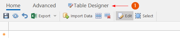
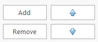
- To add, remove or rearrange their order press the buttons at the bottom of the columns bar. The order will affect how the columns will be displayed, from left to right in the table itself.
Column Properties
Column properties can be divided into three main parts:
- Column Type,
- Data Types
- Default View
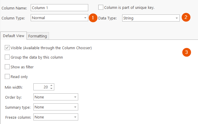
Column Types
There are four Column Types to choose from the drop-down button.
Normal
The default column type is Normal which allows you to select from the available data types mentioned above.
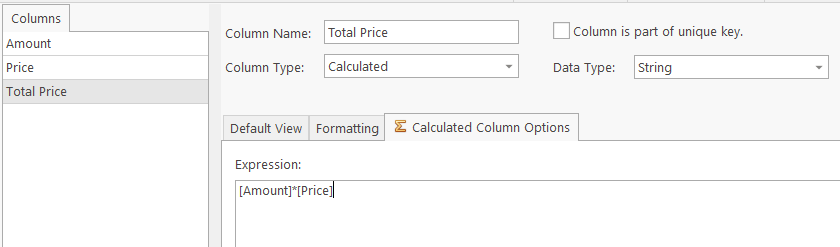
Calculated
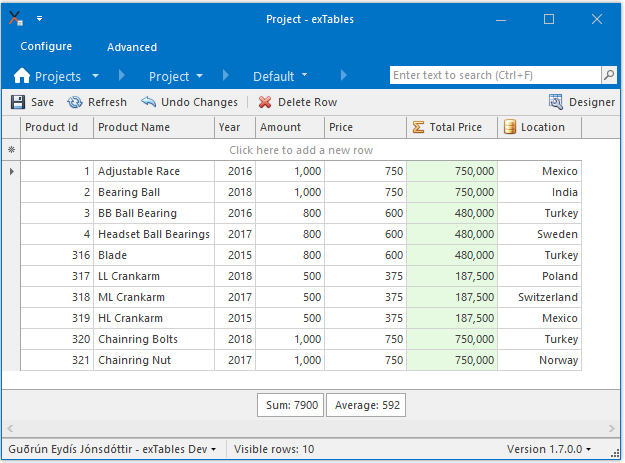
A calculated column is a column where the value is calculated from other columns. In the example above the columns Amount and Price are columns of the number data type. To calculate the total price we multiply Amount with Price.
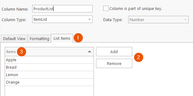
Item List
A column that should have values from a fixed set of items can be made as an ItemList column. In the List Items(1) tab it is possible to add or remove(2) the values that should be available to select from the column in the table. As the items have been added to the list they can be previewed in the items(3) table. The values will be displayed in a drop-down list.
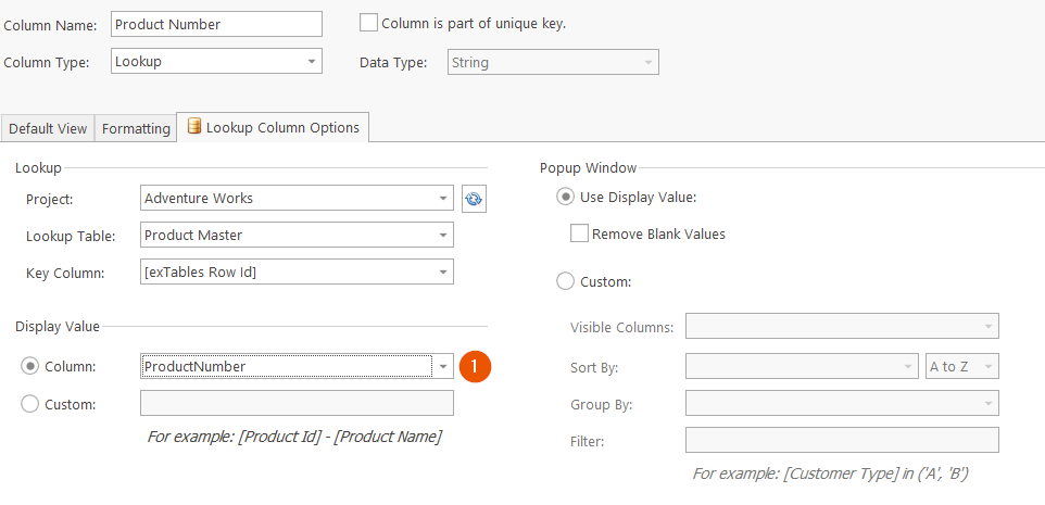
Lookup
A lookup column is similar to item list columns, the possible values are a list of specific values. The difference is that Lookup columns reference another table to create the selection. Simply fill out all the properties above and exMon Data Management will create a drop-down list containing all unique values from the selected source column (1).
Further details can be found in the article Lookup Column.
Data Types
Allowed data types:
- String
- Number
- Decimal
- DateTime
- Number
- Large Number
- Checkbox
For all data types, except for the checkbox, a Formatting tab will appear next to the Default View tab. The Formatting tab will give you control of how your values are displayed in Exmon Data Management.
Known limitations for Data Types
Checkbox
The formatting tab will not be visible.
Geography
The formatting tab will not be visible. Options to group data by Geography column, order and filtering by Geography are also unavailable. In addition, it is impossible to create tables or import data with Geography columns into existing tables directly from databases.
The Geography type has a determined formatting style due to the requirements of the underlying code. When using the type manually in Exmon DM, the expected format is:
POINT(longitude latitude)
Examples of accepted POINT inputs:
POINT(64.14267775416818 -21.927482942189883)
POINT(139.75305211628321 35.68501836478023)
or
POINT(64,93019536694598 -14,033918552875875)
POINT(134,869402196744 -26,106644744015128)
To account for the cultural differences in dealing with decimal point, using a comma is possible in the POINT descriptor.
However, Exmon DM will automatically appropriate the input to the internationally popular format with the dot signifying the decimal point.
For data imports (“Import Data” button) (e.g. Excel) into existing tables the only accepted input would be, so a comma is not accepted:
POINT(64.14267775416818 -21.927482942189883)
POINT(139.75305211628321 35.68501836478023)
However, the underlying database will be using the Spatial Location style descriptions, to save the above POINT-style, such as these:
0xE6100000010CAC4DA8856FED35C03801E0A121095040
0xE6100000010CFBF188AEAED74140D773C00019786140
Default View
The default View contains properties that all columns have in common.
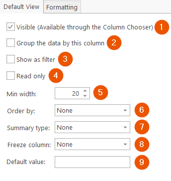
- Visible: Specifies whether the column is visible or not.
- Group the data by this column
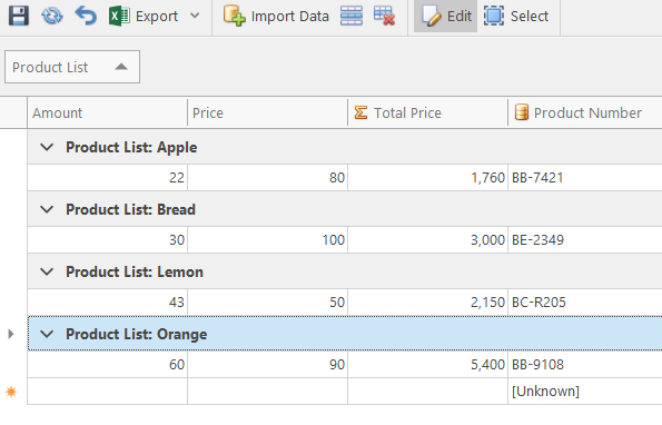
If we set this attribute of the Product List column as true it will group its values together like the picture above. - Show as filter
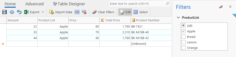
If the show as filter attribute is set to true the selected column will show as a filter in the Table Editor view. The filter is displayed on the right side and when an item is selected the grid view will filter the data based on that selection. For example, by checking the show as filter box for the column ProductList and select Apple as our filter, then the grid in the Table Editor view will look like the picture above. - Read-only: Values of a read-only column can not be changed.
- Min width: If the column should only contain a value of a max length you can specify it with this property.
- Order by: Either ascending, descending or none.
- Summary Type: Columns can be summarized with either Sum, Average, Count, Max or Min. The summary value will be displayed at the bottom:
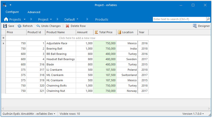
- Freeze column: You can freeze the position of columns to either left or right. In this example, the columns Price and Product Id are frozen to the left and Year to the right.
- Default Value: You can choose a default value for a column so that every time you create a New Row the cell value for that row will automatically become the chosen default value. For the default values to appear in the grid, first, add a New Row and then select space for the default values to appear.
In the example below, the string column 'Customer' has the default value 'Some Customer'.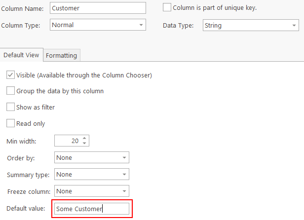
When a New Row is created in the Table Editor the default value will appear for that column.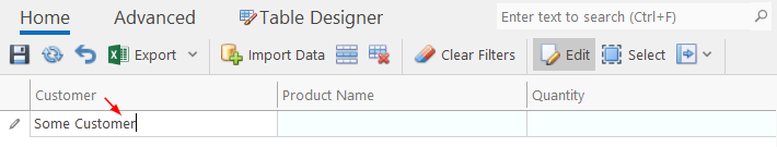
Size & Format
The Size & Format tab contains properties that not all columns have in common. That tab differs depending on the Data Type selected.
Size & Format: Numeric
Double, Decimal, Number and Large Numbers have very similar Size & Format tabs. It consists of Number Formatting and Column Constraints.
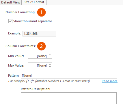
- Number Formatting More detailed formatting for numbers.
- Column Constraints: This allows you to set constraints for the column. You can set the Min Value or Max Value so the user gets a warning if his value does not fit inside the range. You can also set a Pattern for the column which warns the user if he tries to insert a value that does not fit into the pattern. You simply insert the pattern in regex form, to the Pattern input field. For example: "[1-3]*" (matches numbers 1-3 zero or more times)
Size & Format: Strings
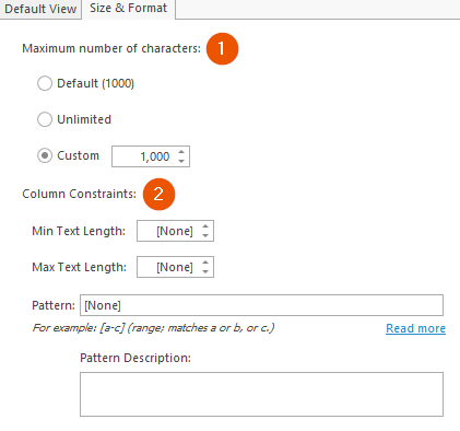
- A maximum number of characters: Controls how many characters the user can insert to the cell. When the max value is reached he can not add any more characters.
- Column Constraints: This allows you to set constraints for the column. You can set the Min Text Length or Max Text Length so the user gets a warning if the number of characters in the cell does not fit inside the range. You can also set a Pattern for the column which warns the user if he tries to insert a value that does not fit into the pattern. You simply insert the pattern in regex form, to the Pattern input field. For example: "[a-c]" (range; matches a or b, or c.)
Size & Format: DateTime
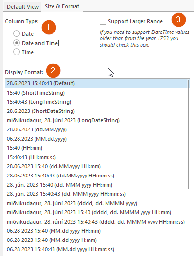
- Column Type: Controls if the values in the columns are Date, Date and Time or Time.
- Display Format: This allows you to set more specific formatting to your cell value.
- Support Larger Range: In some cases, you might want to be able to support DateTime values from before 1753. Storing these values takes more place than the classic DateTime value so you must check this box specifically for this support and then the column will be created as a datetime2 column in the database.